Button
Buttons can be placed either within a toolbar or any other place in the layout. By adding buttons to the layout administrators can enable users to perform actions within a layout. A button can contain actions defined in the document definition or layout actions such as adding a line to a grid or creating a new document.
Different types of actions
As indicated buttons can be used to run different types of actions. Depending on the dataset type you will be able to add buttons that execute a user action (document dataset) or a bulk action (document list dataset). However, aside from these different action types configured in the document definition, there are also actions that can only be configured in the layout itself. Additionally, there are actions related to a particular control like adding or removing a line. These actions will only be available for buttons you add to a control toolbar. Hence, which actions are available for a button is determined by the dataset it is connected to (single document vs a list of documents), and the position in the layout (on a control toolbar vs any other position in the layout).
Dataset actions
- New Document - this will create a new document in the dataset the button is connected to. This type of action can only be used in a document dataset.
- Clear Data - this will clear all data from the dataset. You will mainly use this action in combination with a filter dataset as a way to reset your filters.
Control actions
- Add Line - this will add a new line to a grid control or listview control. This action can be used in combination with a document dataset as well as a document list dataset.
- Copy Line - this will copy the selected lines or items in a grid or listview. This action can only be used in combination with a document dataset.
- Remove Line - this will remove the selected lines or items in a grid or listview. This action can only be used in combination with a document dataset.
Configuring the button control
You can add buttons to a layout in two ways. The easiest way is to drag an action from the dataset and drop it onto the layout or toolbar. This way the button is already connected to the dataset, and the action that should be executed is already configured in the button properties. Another way to add a button is by dragging the button control from the generic controls list onto the layout or toolbar.
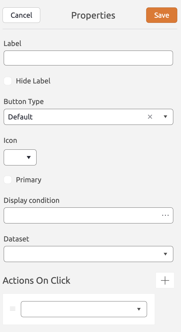
The button control has the following properties:
Label (Required) The label will be displayed on the button. If you add a button directly from the dataset, the label will be inherited from the document definition. You can use BizzStream (translation) expressions. Hide Label (Optional) If checked, the label will be hidden from view. For instance, if you only want to display an icon on the button. Button Type (Optional) The render mode for the button. Default will render the button with a border and background color. If you select Slim the background color and border will not be rendered. The Slim mode is often used for buttons on a control toolbar, only displaying an icon. Icon (Optional) The icon that will be displayed in front of the label in the button. Primary (Optional) If checked, the button will be rendered as a primary button. A primary button has a background color, whereas secondary buttons have a standard grey background. Primary buttons usually indicate that a particular action is preferrred to be run over other actions. Note that if the button type is 'Slim' this property will not have any effect. Display condition (Optional) A BizzStream expression that determines under what circumstances the button should be displayed. Dataset The dataset the action is run in. Actions on Click Add one or more actions by clicking  . .From the picklist, select the action you want to run when users click the button. To remove an action from the button, click  . . |
 |
