Field Group
The Field Group control is an example of a container control. This implies that other controls can be positioned within the field group. The advantage of using this control is that information can be grouped together and logic can be applied to the group as a whole. For instance, all fields can be hidden or disabled by one condition, instead of having to configure the condition on each field separately. The structure of the field group control is identical to that of the layout itself. Elements are positioned in a column in a row.
Render modes
The field group has two render modes: default and collapsible. In the default view users generally won't see the control. However, a border can be applied. Whenever the control is configured as a collapsible, users can expand and collapse the control. That way fields can be hidden from view if they're not immediately required. Vice versa the control can be expanded again to uncover the information. Users can toggle the state of the control from collapsed to expanded by clicking the  icon on the right. You can use an icon as well as a title to clarify the contents of the collapsible. Moreover, in the top section of this control action buttons can be placed. If there are actions in the control toolbar users can execute these actions by clicking them. The style of these buttons is different from other buttons as they do not have a background color and border. It is recommended to work with icons for actions in this toolbar as much as possible.
Configuring the field group control
To add a field group control to the layout, simply drag it from the Generic Controls bar on the left-hand side. Upon dropping the field group control, the properties pane will open on the right. Here, you can configure a range of properties that apply to the control as a whole. The field group control has the following properties:
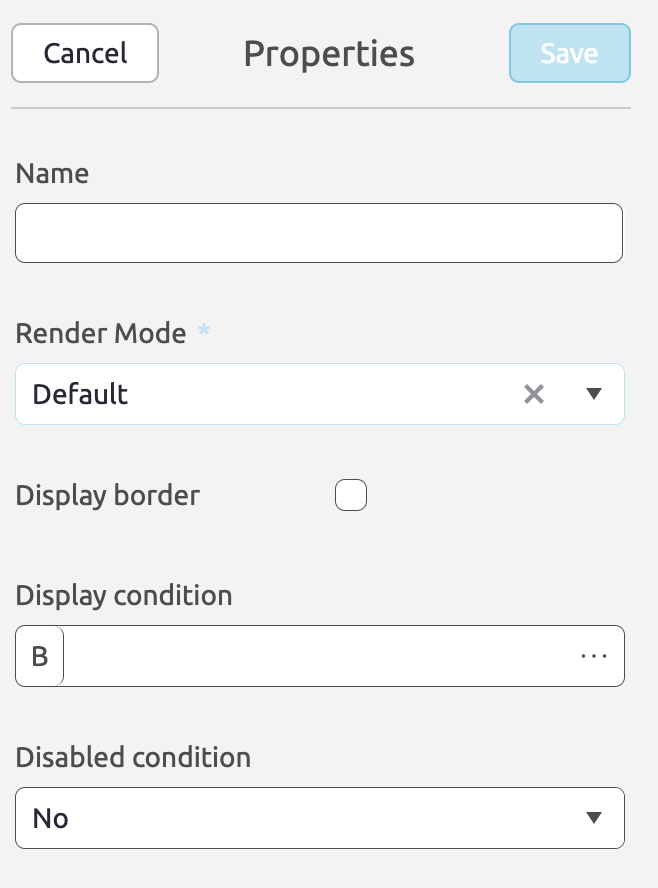
Name (Optional) The name of the control. This can be used to refer to the control in a BizzStream expression. Render Mode (Required) Determines whether the control is rendered as a default field group or as collapsible control. Display border (Optional) When this is checked, a border will be displayed. Display condition (Optional) A BizzStream expression that determines under what circumstances the field group control should be displayed. Disabled condition (Optional) A BizzStream expression that determines under what circumstances users can interact with the controls in the field group control. This can also be set to true or false. |
 |
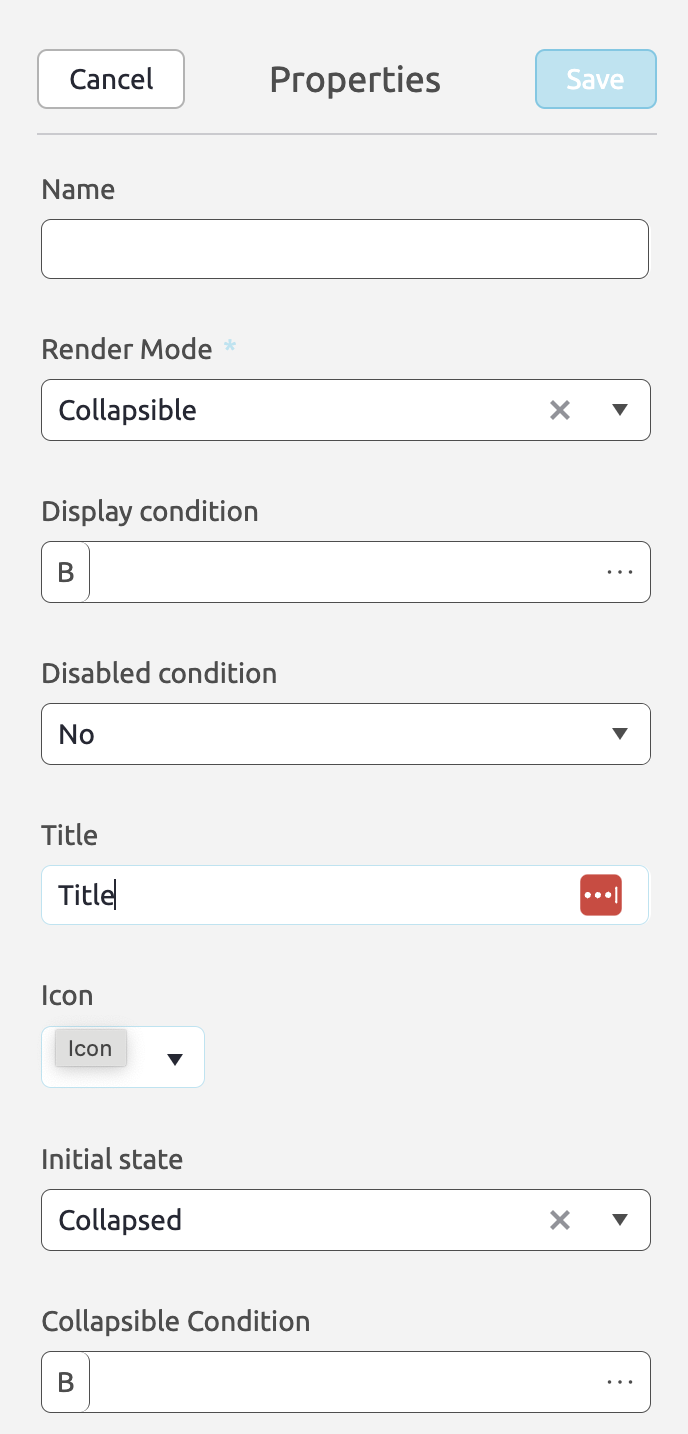
For field groups with render mode collapsible the following properties can be set:
Title (Optional) The title for the collapsible control. The title will be displayed in the top of the control for the user to read. You can use BizzStream expressions to make the label dynamic, or to translate it into the user's language. Icon (Optional) The icon that will be displayed in front of the label in the top of the collapsible. Display condition (Optional) A BizzStream expression that determines under what circumstances the collapsible control should be displayed. Disabled condition (Optional) A BizzStream expression that determines under what circumstances users can interact with the collapsible control. I.e. whether they can expand or collapse the control.This can also be set to true or false.Initial state (Optional) The state the control should be in when opening the layout: expanded or collapsed. Collapsible condition (Optional) A BizzStream expression that causes the control to automatically collapse. I.e. whether they can expand or collapse the control.This can also be set to true or false. |
 |
The area behind the title serves as a toolbar for the control. You can drag buttons and dataset actions onto it.
