Image Slider
The image slider control lets you preview attachments to your users. PDF files and images uploaded in an attachment field will be displayed in a carousel so users can immediately see the result without having to download the files. This is especially convenient during invoice approval. Users can view and check invoices in a glance.
Using the image slider
The image slider is fairly intuitive to use. It's a control that is commonly seen in many websites. Users can browse through images and files by using the arrow buttons in the control. These arrow buttons will appear when you hover the control. Another way of browsing through the contents is by clicking the dots on the bottom of the control.
Configuring the image slider
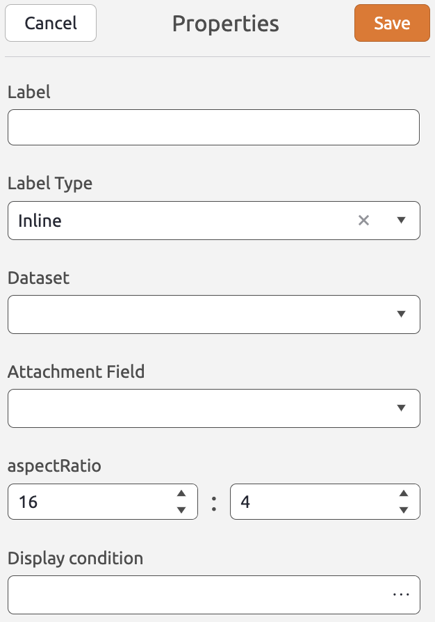
You can add an image slider control to the layout by simply dragging it from the Generic Controls bar on the left-hand side. Upon dropping the image slider, the properties pane will open on the right. Here, you can configure a range of properties that apply to the control as a whole. The image slider control has the following properties:
Label (Optional) The label displayed for the image slider (e.g. "Photos") Label Type (Optional) Determines whether the label part of the label control is displayed inline, stacked, or hidden. Dataset (Required) The dataset which contains the attachment field from which the files should be displayed. Attachment Field (Required) Represents the field in the document definition which contains the files you want to display. Aspect Ratio (Optional) Determines the aspect ratio of the files/images displayed in the image slider. By default this is set to 16:4. Display condition (Optional) A BizzStream expression that determines under what circumstances the image slider should be displayed. |
 |
