Enhance Your BizzStream Aero Experience with Layouts
Layouts within BizzStream Aero are used for creating optimal user experiences.
The Power of Aero Layouts
BizzStream Aero optimizes your experience by providing a flexible layout system. Administrators can seamlessly integrate data from various sources using the innovative datasets feature, which organizes and harmonizes information efficiently.
A BizzStream layout is structured as a grid, defined by rows and columns. A third dimension, elements, are placed within columns, and columns are positioned within rows. Consequently, a row can contain multiple columns, and a column can hold a list of elements. While theoretically supporting an infinite number of columns, it's advisable to limit the number of columns within a layout due to typical horizontal space constraints. On the mobile application, all controls will rearrange into a single column on a smartphone, whereas tablets support multiple columns for a flexible and responsive display.
You can easily change the amount of rows and columns in a layout:
- If you want to add a row or column, simply hover the border of a row or column and click the
 icon.
icon. - If you want to remove a row or column, click the
 icon.
icon.
In Aero you can also configure the width of a column, allowing you to further customize layouts:
- Click the
 icon to open the column properties.
 - Under Column Width you can enter a value for the width.
- Under Unit you can determine whether the width represents a pixel value or a percentage.
If no custom width is configured, the available screen width will be equally distributed across the columns. The same holds true for the situation in which some columns have a width assigned, but others do not. In that case, the available remaining width will be equally distributed across the remaining columns.

Explore a World of Controls
Aero layouts provide an extensive range of controls for designing effective interfaces. These controls automatically adapt to the document dataset type, simplifying configuration and streamlining the design process.
While controls offer inherent adaptability, some provide advanced customization options. These allow you to override specific document definition configurations, providing greater control over behavior and display. This comprehensive list of available generic controls serves as a guide for your design process.
Generic controls are fundamental elements that can be used in combination with other controls or data. Some, for instance, are simply 'containers' for organizing information intuitively and guiding the user step-by-step through the layout. Others, such as the grid control, actively render data from their connected dataset.
For dynamic interface management, most of these controls can be conditionally hidden using BizzStream expressions. This functionality enables you to implement rules for displaying or concealing layout elements based on specific data conditions or user interactions.
Furthermore, many controls support a disabled property. This feature allows you to conditionally prevent users from interacting with or modifying the data within a control, providing granular control over user input.
Understanding the Control Group
The Control Group is a fundamental building block within Aero layouts, designed to enhance user interactions with dataset fields:
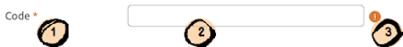
- Label: The label clearly identifies the field for the user, providing essential context.
- Input Component: This is the heart of the Control Group, enabling users to view or edit the dataset field effortlessly.
- Validation Indicator: A helpful feature that appears when the input component contains invalid data, ensuring data accuracy.
Configure Label Types
Aero offers flexibility in rendering field labels. You can choose the default inline display (right in front of the input field) or stack it on top of the input area for an alternative layout. For a streamlined interface, you can also hide the label. Additionally, you can override the document definition label by setting the label property in the layout JSON, providing comprehensive customization.
You can also apply formatting to this control group. The control properties pane includes a Formatting section, where you can define the space allocated to the label in pixels or as a percentage of the available width. For more details, refer to our layout configuration documentation.
Getting Started
As you configure your layouts, we encourage you to experiment with different controls and combine them strategically to align with specific business processes. Focus on clear, descriptive labels and intuitive layouts to ensure users can effortlessly navigate and interact with their data.
BizzStream Aero layouts offer powerful tools to streamline workflows and enhance user experiences. Leverage this flexibility to design truly impactful interfaces for your solutions.