Tab
Tabs can structure data in an organized way. The user can view information by category rather than all at once. With the tab control you can create different tabs. Like the collapsible control, the tab control has the same structure as the layout itself. Meaning that you can place controls (elements) in one or multiple columns in one or more rows. Tabs can be made dynamic by using BizzStream expressions in the title. But they can also be conditionnally hidden or disabled.
Using the tab control
On web users can simply click a tab to open it. The contents of that tab will then be displayed for the user to interact with. If they have permissions to do so. In the mobile app users can also scroll to through tabs by swiping the screen.
Configuring the tab control
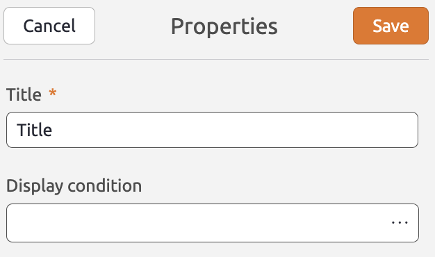
To add a tab control to the layout, simply drag a tab control from the Generic Controls bar on the left-hand side. Upon dropping the tab control, the properties pane will open on the right. Here, you can configure a range of properties that apply to the control as a whole. The tab control has the following properties:
Title (Required) A title merely for your own reference. Hide Label (Optional) If checked, the label will be hidden from view. For instance, if you only want to display an icon on the button. Display condition (Optional) A BizzStream expression that determines under what circumstances the tab control should be displayed. |
 |
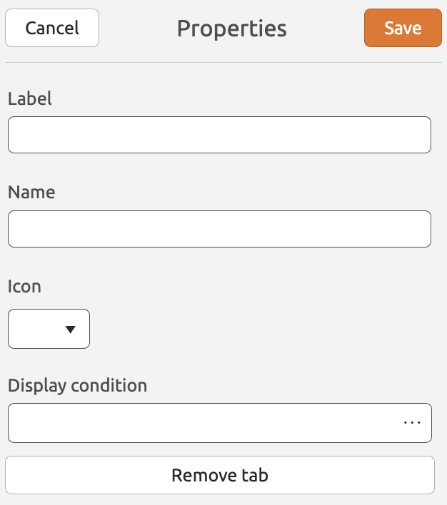
To configure the properties for a tab, click  . Tabs have the following properties:
Label (Optional) The label the user sees on the tab. You can also use BizzStream expressions to make the label dynamic, or to translate it into the user's language. Name (Optional) The name of the tab. This currently doesn't serve any purpose. Display condition (Optional) A BizzStream expression that determines under what circumstances the tab should be displayed. Icon (Optional) The icon that will be displayed in front of the label on the tab. Remove tab Removes the tab from the tab control. |
 |
Now you can drag dataset controls or other generic controls into the tab.
To switch tabs, simply click another tab in the control.
To add a new tab, click  .
.
