Menu Blocks
When using the application, the menu system helps you find what you need quickly and easily. At the core of this system are Menu Blocks, the fundamental components that define what is presented and how you move through the application. These versatile blocks serve as containers for content and interaction, allowing for precise and dynamic user journeys.
The menu editor allows for the creation of menus by strategically employing two primary types of menu blocks:
-
Treeview Blocks: These blocks present information in a clear, organized list, with items that can be expanded or collapsed. This helps users explore different layouts and other treeviews. Making it easy to navigate through the different available layouts.
-
Layout Blocks: Layout blocks display the actual content, forms, or data in the selected layout. They could be considered landing pages, that show information or allow actions to be performed. More information about layouts can be found here.
Menu Blocks work together seamlessly to help users navigate from general topics to specific details, ensuring clear guidance within the application.
This is how the blocks are shown and used:

This shows how to add the different blocks and make the first simple menu.
Treeview menu blocks
In treeview menu blocks, users can choose items from a tree-like structure. Each item can have child items, allowing administrators to design user-centric menu structures. The treeview block has the following properties:
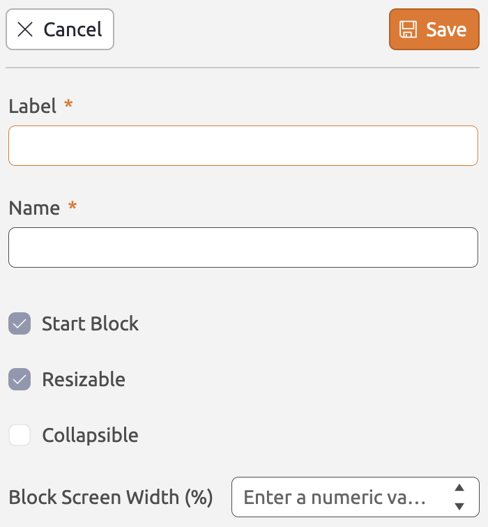
Label (Required) This will be used in the breadcrumbs bar. The user can easily navigate to other open menu blocks using the breadcrumbs bar Name (Required) This is used to reference the menu block in (for instance) a menu path or a filter. The block name should be unique within a menu. Start block (Only one required) Indicates if the selected block is the start block for the menu. Resizable (Optional) Allows the user to be able to resize the menu blocks. Collapsible (Optional) This allows the user to show/hide the menu block. Block Screen Width (Optional) If no width is configured, the default width will be applied. For a start block the default width is 270 pixels. Other blocks will be assigned 500 pixels as default width. |
 |
Once added, you can populate the treeview block with items. Click the  icon to add root-level items. For child items, click the icon adjacent to the root item. You can delete blocks by clicking or using
 Backspace/Delete, or by clicking the  icon. The icons will show up when you hover the block/item. Treeview items have the following properties:
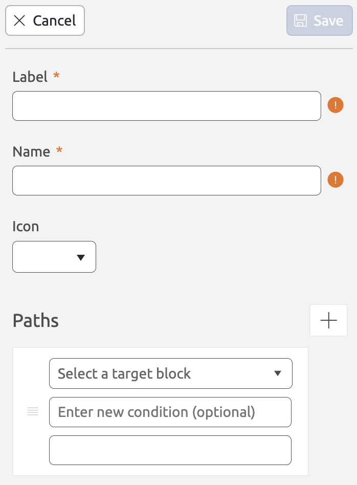
Label (Required) This will be the label users see in their menu. Name (Required) This is used to reference the treeview item in (for instance) a menu path or a filter. The item name should be unique within a block. Icon (Optional) The icon that will be displayed in front of the label in the menu block. Paths (Optional) Contains the path conditions. |
 |
Layout menu blocks
A layout block contains, as the name indicates, a layout. The document or documents that will be rendered in the layout can depend on one (or more) of the other open menu blocks, depending on the dataset filter. You can add a layout block to a menu by clicking the Layout button. You can also click and drag the button to determine the position of the menu block in the menu editor. The layout block has the following properties:
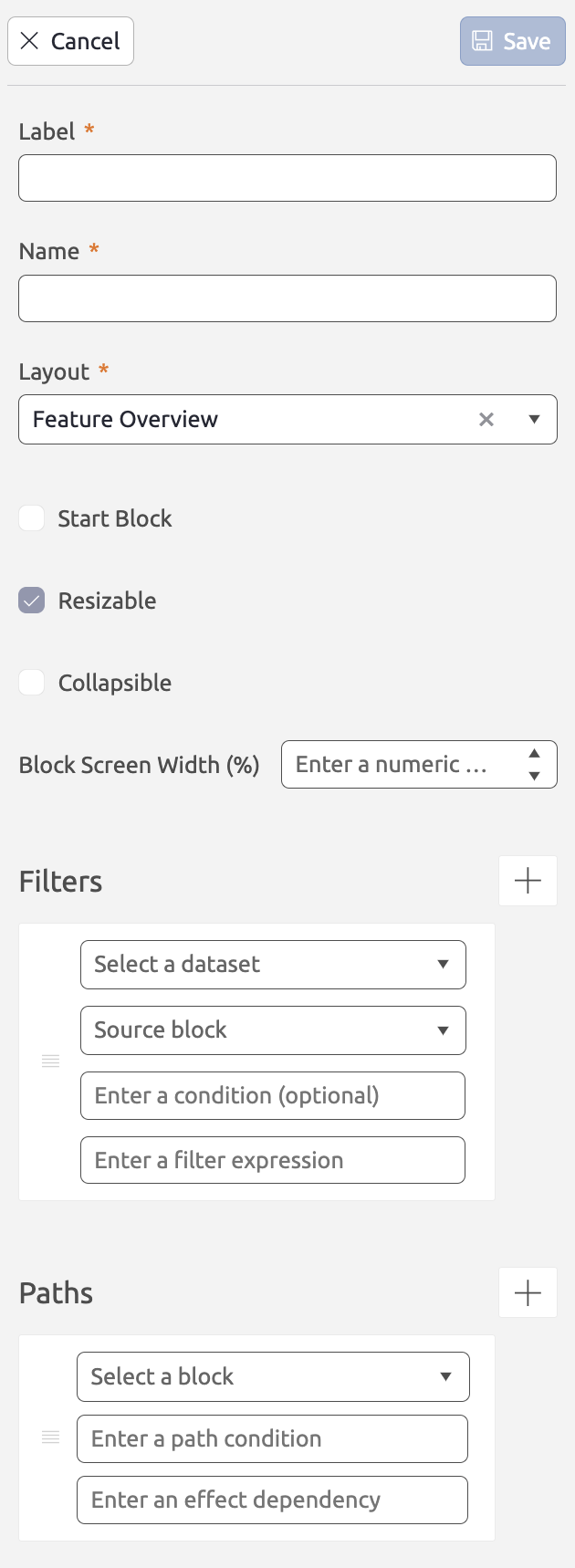
Label (Required) This will be used in the breadcrumbs bar. The user can easily navigate to other open menu blocks using the breadcrumbs bar. Name (Required) This is used to reference the menu block in (for instance) a menu path or a filter. The block name should be unique within a menu. Layout (Optional) The layout that will be displayed in the menu block. Start block (Only one required) Indicates if the selected block is the start block for the menu. Resizable (Optional) This allows user to resize menu blocks. Only indicates the width. Collapsible (Optional) This allows the user to show/hide the menu block. Block Screen Width (Optional) If no width is configured, the default width will be applied. For a start block the default width is 270 pixels. Other blocks will be assigned 500 pixels as default width. Filters (Optional) Contains the filters for the datasets available in the layout. Filters - Dataset (Required) Determines the dataset that should be affected by the filter. Filters - Source block (Required) Determines for which incoming connection the filter should be applied. Menu blocks can have multiple incoming connections (i.e. source blocks). A different dataset filter might apply for every source block. Filters - Condition (Optional) Contains the a condition for the filter to be applied. E.g. maybe the filter only needs to apply for certain types of users. Filters - Filter expression (Optional) Contains the actual filter expression to filter the dataset. Paths (Optional) Contains the path conditions. |
 |
Tips
In the menu editor there is plenty of space to build your menu. For the best experience, take note of the following:
- You can zoom in and zoom out by scrolling in the menu editor, using a pinch gesture on your track pad, or simply clicking the
 or
or  buttons in the bottom-left corner of the menu editor.
 - To move within the editor, simply click and drag your cursor across the menu editor.
- You can center your menu in your view by clicking the
 button. The menu editor will center your menu and adjust the zoom level to fit it into view.
 - To prevent accidentally moving statuses or actions around, you can lock/unlock the menu. You can do this by clicking the
 button. Note that you will still be able to open the properties pane to configure permissions and actions.
 - Treeview blocks have an expanded and collapsed state. You can collapse/expand all treeview blocks simultaneously by clicking the
 button.